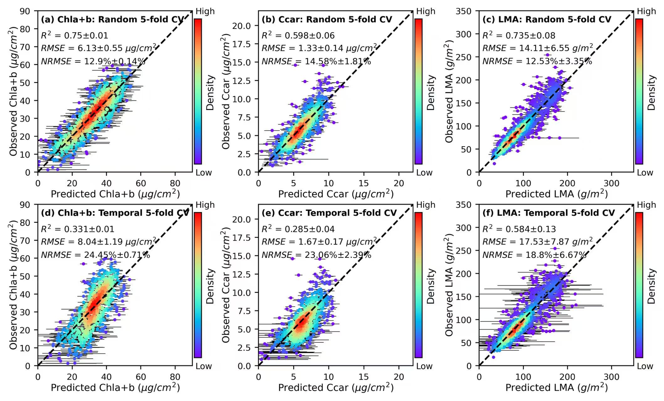
1. Scatter plots
import pandas as pd
import numpy as np
from scipy.stats import gaussian_kde
import matplotlib.pyplot as plt
def d(x,y):
xy = np.vstack([x,y])
z = gaussian_kde(xy)(xy)
return z
# plot a 2*3 axes figure with 100 dpi.
fig = plt.figure(figsize=(10.5,6), dpi=100)
config = {"font.family":'Helvetica'}
plt.subplots_adjust(wspace =0.2)
plt.rcParams.update(config)
# basic information used in the figure, including the x/y lim, units, accuracy, text location, etc.
lims = {'Chla+b':90,'Ccar':22,'LMA':350}
units = {'Chla+b':'($\mu g/cm^2$)','Ccar':'($\mu g/cm^2$)','LMA':'($g/m^2$)'}
R2_mean = [0.75, 0.598, 0.735, 0.331, 0.285, 0.584]
R2_std = [0.01, 0.06, 0.08, 0.01, 0.04, 0.13]
RMSE_mean = [6.13, 1.33, 14.11, 8.04, 1.67, 17.53]
RMSE_std = [0.55, 0.14, 6.55, 1.19, 0.17, 7.87]
NRMSE_mean = [12.9, 14.58, 12.53, 24.45, 23.06, 18.8]
NRMSE_std = [0.14, 1.81,3.35, 0.71, 2.39, 6.67]
text_loc = [[0.02,0.02,0.02,0.83,0.75,0.67], [0.02,0.02,0.02,0.83,0.75,0.67],[0.02,0.02,0.02,0.83,0.75,0.67],
[0.02,0.02,0.02,0.83,0.75,0.67], [0.02,0.02,0.02,0.83,0.75,0.67], [0.02,0.02,0.02,0.83,0.75,0.67]]
title1 = ['(a)','(b)', '(c)','(d)','(e)','(f)']
title2 = ['Random','Random','Random','Temporal','Temporal', 'Temporal']
# open the dataset.
df = pd.read_csv("data/trait_estimation.csv")
i = 0
for cv in df["CV_methods"].unique():
for tr in df["tr_estimation"].unique():
ax = fig.add_subplot(2,3,i+1)
data = df[(df["CV_methods"]==cv)&(df["tr_estimation"]==tr)]
dff = data[(df['final_model_result']>0)&(data[tr]>0)]
x,y = dff['final_model_result'], dff[tr]
# plot the error bars.
iteration_df = dff.loc[:,'iteration_1':'iteration_100']
mean_all,std_all = np.mean(iteration_df,1), np.std(iteration_df,1)
lc_all,hc_all = mean_all-1.96*std_all,mean_all+1.96*std_all
x_right, x_left = hc_all - x, x - lc_all
scatter = ax.scatter(x, y, c= d(x,y), s=4,cmap='rainbow',zorder = 2)
ax.errorbar(x,y, xerr=(x_left, x_right),fmt='.',color = 'none',ecolor='k',elinewidth=0.4,zorder = 1)
ax.plot((0, 1), (0, 1), transform=ax.transAxes, ls='--',c='k', lw = 1.5,label = '1:1 line')
cbar = plt.colorbar(scatter, ax=ax,pad=0.01, shrink=0.9)
ax.text(1.02,0.98,'High',transform=ax.transAxes,fontsize = 8)
ax.text(1.02,-0.02,'Low',transform=ax.transAxes,fontsize = 8)
cbar.set_ticks([])
cbar.set_label('Density', fontsize=9,labelpad=0.1)
ax.set_xlim(0,lims[tr])
ax.set_ylim(0,lims[tr])
ax.set_xlabel(f'Predicted {tr} {units[tr]}', fontsize=10, labelpad = 0.2)
ax.set_ylabel(f'Observed {tr} {units[tr]}', fontsize=10, labelpad = 0.2)
ax.tick_params(axis='both', direction='out', labelsize=10)
R2_ = f'$R^2$ = {R2_mean[i]}\u00B1{R2_std[i]}'
RMSE_ = f'$RMSE$ = {RMSE_mean[i]}\u00B1{RMSE_std[i]} {units[tr][2:-1]}'
NRMSE_ = f'$NRMSE$ = {NRMSE_mean[i]}%\u00B1{NRMSE_std[i]}%'
ax.text(text_loc[i][0],text_loc[i][3],R2_, fontsize=8,transform=ax.transAxes)
ax.text(text_loc[i][1],text_loc[i][4],RMSE_, fontsize=8,transform=ax.transAxes)
ax.text(text_loc[i][2],text_loc[i][5],NRMSE_, fontsize=8,transform=ax.transAxes)
ax.text(0.02,0.93, f'{title1[i]} {tr}: {title2[i]} 5-fold CV', transform=ax.transAxes, fontsize = 8,fontweight='bold')
i = i+1
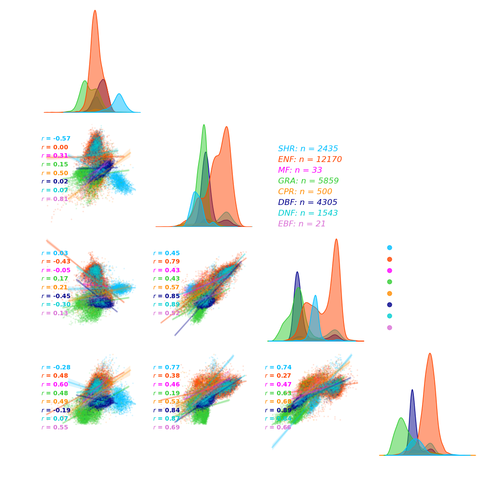
plt.savefig('Figure_export/xxx.png', dpi=600, bbox_inches='tight')Copy import pandas as pd
import seaborn as sns
import matplotlib.pyplot as plt
from scipy.stats import pearsonr
# open the dataset.
df_traits = pd.read_csv("data/NEON_AOP_trait_points.csv")
df = df_traits[["Chla+b", "Ccar", "EWT","Nitrogen","PFT"]]
# define the unit of each traits
unit1 = '($\mu g/cm^2$)'
unit2 = '($g/m^2$)'
# define the palettes for each PFT, either self difine differnt color or sns.hls_palette()
palettes = ["deepskyblue", "orangered","magenta", "limegreen", "darkorange", "darkblue", "darkturquoise", "orchid"]
# palettes = sns.hls_palette(len(df["PFT"].unique()))
# use the sns.pairplot() to show the covariance of different variables.
grid = sns.pairplot(df,hue = "PFT",kind='reg',corner=True,palette = palettes,
plot_kws={"scatter_kws": {"alpha": 0.1, "s":2},"line_kws":{"alpha": 0.3}},diag_kws={"alpha": 0.5})
grid.fig.patch.set_facecolor('none') # Make figure background transparent
grid.fig.patch.set_alpha(0) # Set transparency level for the figure background
for ax in grid.fig.axes:
ax.set_facecolor('none') # Make axes background transparent
# set the x/y labels.
label = [f"Chla+b {unit1}", f"Ccar {unit1}", f"EWT {unit2}", f"Nitrogen {unit1}"]
for i in range(1,4):
grid.axes[i,0].set_ylabel(label[i],fontsize = 12, color = "white")
grid.axes[i,0].tick_params(labelsize=12, colors = 'white')
grid.axes[i,0].spines[['bottom', 'left']].set_color('white')
for i in range(0,4):
grid.axes[3,i].set_xlabel(label[i],fontsize = 12, color = "white")
grid.axes[3,i].tick_params(labelsize=12, colors = 'white')
grid.axes[3,i].spines[['bottom', 'left']].set_color('white')
for i in range(0,4):
grid.axes[i,i].spines[['bottom', 'left']].set_color('white')
grid.axes[i,i].tick_params(labelsize=12, colors = 'white')
grid.axes[2,1].spines[['bottom', 'left']].set_color('white')
grid.axes[2,1].tick_params(labelsize=12, colors = 'white')
# add text inside the figure.
grid.axes[0,0].text(1.05,0.1, f"Covariance of plant traits across PFTs",transform=grid.axes[0,0].transAxes,
fontsize = 12, color = "white", fontweight = "bold",fontstyle='italic')
grid.axes[0,0].text(1.05,0, f" n = {len(df)}.",transform=grid.axes[0,0].transAxes, fontsize = 12,
color = "white", fontweight = "bold",fontstyle='italic')
# add the pearson value of trait-trait relationships for each PFT.
for i, j in zip(*plt.np.triu_indices_from(grid.axes, 1)):
r, _ = pearsonr(df.iloc[:, i], df.iloc[:, j])
grid.axes[j, i].annotate(f"$r$ = {r:.2f} (overall)", (0.02, 0.95), xycoords='axes fraction', fontsize=9, color='white',fontweight = "bold")
k = 0
loc = 0
for pft in df["PFT"].unique():
temp = df[df["PFT"] == pft]
r, _ = pearsonr(temp.iloc[:, i], temp.iloc[:, j])
grid.axes[j, i].annotate(f"$r$ = {r:.2f}", (0.02, 0.8-loc), xycoords='axes fraction', fontsize=9, color=palettes[k],fontweight = "bold")
k = k+1
loc = loc+0.08
# add additional information for trait samples.
k = 0
loc = 0
sns.move_legend(grid, "lower center",bbox_to_anchor=(0.76,0.3), title="PFTs", frameon=False, fontsize = 12)
for pft in df["PFT"].unique():
temp = df[df["PFT"] == pft]
nums = len(temp)
grid.axes[1,1].annotate(f"{pft}: n = {nums}", (1.2, 0.7-loc), xycoords='axes fraction',color=palettes[k],fontsize=12,fontstyle='italic')
k = k+1
loc = loc+0.1
# set the legend parameters.
grid._legend.set_title("PFTs",prop={'size': 12})
title = grid._legend.get_title()
title.set_color("white")
for handle in grid.legend.legendHandles:
handle.set_alpha(0.8)
handle.set_sizes([40])
for text in grid._legend.get_texts():
text.set_color("white")
plt.show()
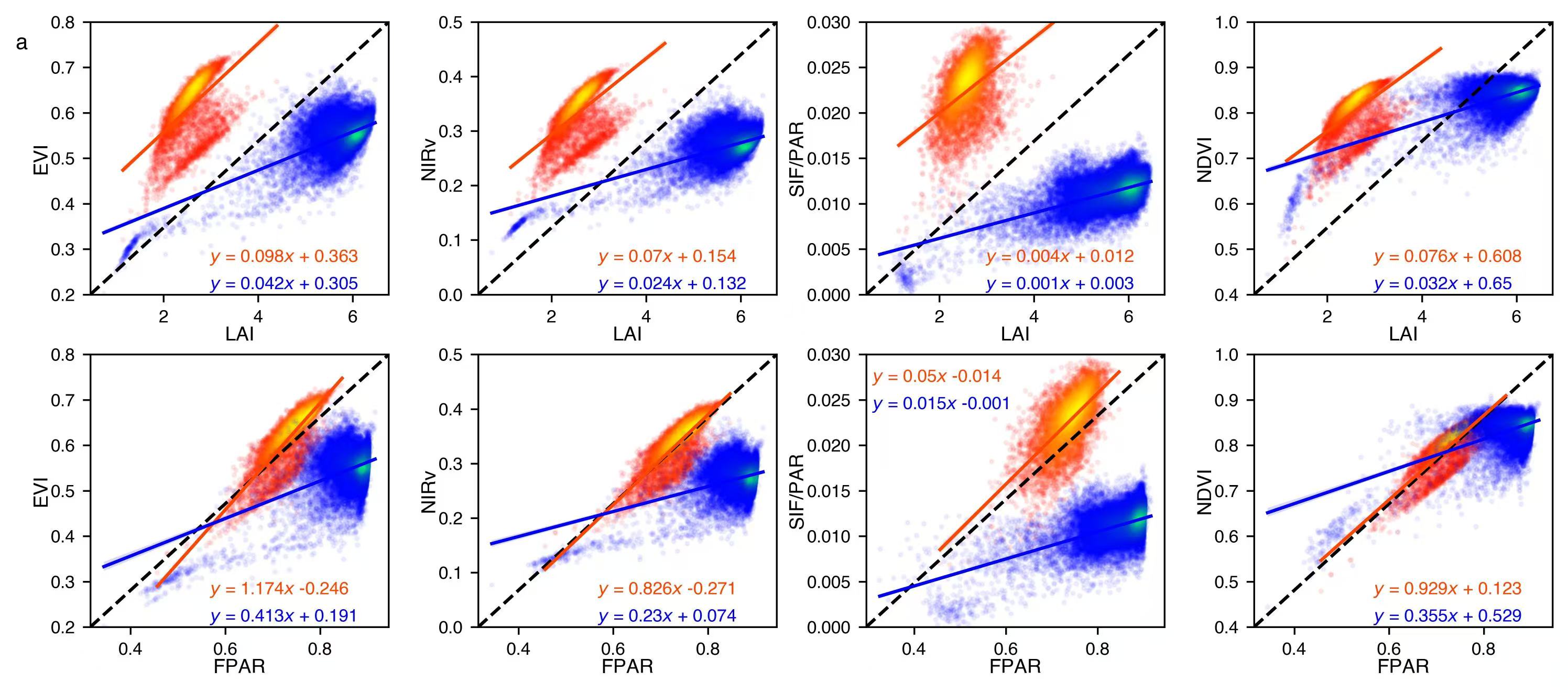
plt.savefig('Figure_export/xxx.png', dpi=600, bbox_inches='tight')Copy import scipy.io as scio
import pandas as pd
import numpy as np
import seaborn as sns
from scipy.stats import gaussian_kde
import matplotlib.pyplot as plt
def d(x,y):
xy = np.vstack([x,y])
z = gaussian_kde(xy)(xy)
return z
def fit_line(x, y):
line_fit = np.polyfit(x, y, 1)
return line_fit[0],line_fit[1]
def sca_plot(ax,x1,x2,y1,y2,variable1,variable2,ylim):
x1 = pd.DataFrame(x1.reshape(1,-1)[0],columns = [variable1])
x2 = pd.DataFrame(x2.reshape(1,-1)[0],columns = [variable1])
y1 = pd.DataFrame(y1.reshape(1,-1)[0],columns = [variable2])
y2 = pd.DataFrame(y2.reshape(1,-1)[0],columns = [variable2])
df1 = pd.concat([x1,y1],axis = 1)
df2 = pd.concat([x2,y2],axis = 1)
df1.dropna(axis=0,how='any',inplace = True)
df2.dropna(axis=0,how='any',inplace = True)
ax.plot((0, 1), (0, 1), transform=ax.transAxes, ls='--',c='k', lw = 1.5)
ax.scatter(df1[variable1],df1[variable2],c= d(df1[variable1],df1[variable2]), s=3,cmap='autumn',alpha = 0.07)
ax.scatter(df2[variable1],df2[variable2],c= d(df2[variable1],df2[variable2]), s=3,cmap='winter',alpha = 0.05)
sns.regplot(variable1,variable2, data = df1, ax = ax,fit_reg=True, ci = 95,scatter=False,line_kws = {'color':'orangered','lw':1.5})
sns.regplot(variable1,variable2, data = df2, ax = ax,fit_reg=True, ci = 95,scatter=False,line_kws = {'color':'blue','lw':1.5})
ax.set_xlabel(variable1, fontsize=9, labelpad = 0.2)
ax.set_ylabel(variable2, fontsize=9, labelpad = 0.2)
ax.set_ylim(ylim[0],ylim[1])
ax.tick_params(labelsize=8)
a1,b1 = fit_line(df1[variable1],df1[variable2])
a2,b2 = fit_line(df2[variable1],df2[variable2])
if (variable1 =='FPAR')&(variable2 =='SIF/PAR'):
if b1>0:
ax.text(0.02,0.9, f'$y$ = {str(round(a1,3))}$x$ + {str(round(b1,3))}', transform=ax.transAxes, fontsize = 8,c = 'orangered')
else:
ax.text(0.02,0.9, f'$y$ = {str(round(a1,3))}$x$ {str(round(b1,3))}', transform=ax.transAxes, fontsize = 8,c = 'orangered')
if b2>0:
ax.text(0.02,0.8, f'$y$ = {str(round(a2,3))}$x$ + {str(round(b2,3))}', transform=ax.transAxes, fontsize = 8,c = 'blue')
else:
ax.text(0.02,0.8, f'$y$ = {str(round(a2,3))}$x$ {str(round(b2,3))}', transform=ax.transAxes, fontsize = 8,c = 'blue')
else:
if b1>0:
ax.text(0.4,0.12, f'$y$ = {str(round(a1,3))}$x$ + {str(round(b1,3))}', transform=ax.transAxes, fontsize = 8,c = 'orangered')
else:
ax.text(0.4,0.12, f'$y$ = {str(round(a1,3))}$x$ {str(round(b1,3))}', transform=ax.transAxes, fontsize = 8,c = 'orangered')
if b2>0:
ax.text(0.4,0.02, f'$y$ = {str(round(a2,3))}$x$ + {str(round(b2,3))}', transform=ax.transAxes, fontsize = 8,c = 'blue')
else:
ax.text(0.4,0.02, f'$y$ = {str(round(a2,3))}$x$ {str(round(b2,3))}', transform=ax.transAxes, fontsize = 8,c = 'blue')
return
data = scio.loadmat('data/Figure_1_S2_S3_S4_S7_data.mat')
x_axis = [['LAI_cb','LAI_an'],['FPAR_cb','FPAR_an']]
y_axis = [['EVI_cb','EVI_an'],['NIRv_cb','NIRv_an'],['SIF_PAR_cb','SIF_PAR_an'],['NDVI_cb','NDVI_an']]
v1 = ['LAI','FPAR']
v2 = ['EVI','NIRv','SIF/PAR','NDVI']
#*************************************************************************
fig,ax = plt.subplots(2,4,figsize = (12,5))
config = {"font.family":'Helvetica'}
plt.subplots_adjust(wspace =0.3,hspace =0.22)
plt.rcParams.update(config)
y_lim = [[0.2,0.8],[0,0.5],[0,0.03],[0.4,1]]
for i in range(2):
for j in range(4):
x1,x2,y1,y2 = data[x_axis[i][0]],data[x_axis[i][1]],data[y_axis[j][0]],data[y_axis[j][1]]
variable1,variable2 = v1[i],v2[j]
print(i,j,x_axis[i][0],x_axis[i][1],y_axis[j][0],y_axis[j][1])
print(variable1,variable2)
print('--------------------')
sca_plot(ax[i][j],x1,x2,y1,y2,variable1,variable2,y_lim[j])
ax[0][0].text(-0.25,0.9, 'a', transform=ax[0][0].transAxes, fontsize = 10,fontweight = 'bold')
plt.savefig('Figure_export/Extended Data Figure 3(a).png', dpi=600, bbox_inches='tight')Copy
2. Line plots
import matplotlib.pyplot as plt
import pandas as pd
import matplotlib.ticker as ticker
# open the data.
df = pd.read_csv("data/seasonal_traits.csv")
# basic information used in the figure
tr_name = ["Chla+b", "Ccar","EWT", "Nitrogen"]
units = {'Chla+b':' ($\mu g/cm^2$)','Ccar':' ($\mu g/cm^2$)','EWT':' ($g/m^2$)', "Nitrogen":" ($\mu g/cm^2$)"}
title = ["(a)","(b)","(c)","(d)"]
styles = {"BART":{'linestyle': (0, (3, 1, 1, 1, 1, 1)), 'marker': 'o', "color":'#FF0000'},
"HARV":{'linestyle': (0, (5, 1)), 'marker': 's', "color":'#FFA500'},
"SCBI":{'linestyle': ":", 'marker': '^', "color":'#CCCC00'},
"MLBS":{'linestyle': "-.", 'marker': '*', "color":'#0000FF'},
"ORNL":{'linestyle': '-', 'marker': 'X', "color":'#4B0082'},
"TALL":{'linestyle': (0, (3, 1, 1, 1)), 'marker': 'p', "color":'#EE82EE'}}
#******************************************************************************
fig = plt.figure(figsize = (12,6))
fig.set_facecolor('none') # Make figure background transparent
fig.set_alpha(0)
config = {"font.family":'Helvetica'}
plt.subplots_adjust(wspace =0.18, hspace =0.05)
plt.rcParams.update(config)
s = df["site"].unique()
style = {key: styles[key] for key in s}
# loop the traits for plotting
for i, tr in enumerate(tr_name):
ax = fig.add_subplot(2,2,i+1)
ax.set_facecolor((0,0,0,0.0))
ax.grid(color='gray', linestyle=':', linewidth=0.3)
kk = 0
for site in s:
df_temp = df[df["site"]==site]
df_temp["month"] = df_temp["month"].astype(int)
df_temp = df_temp.sort_values(by='month')
x1,y1 = df_temp["month"],df_temp[f"{tr}_mean"]
lc1,hc1 = df_temp[f"{tr}_mean"]-df_temp[f"{tr}_std"], df_temp[f"{tr}_mean"]+df_temp[f"{tr}_std"]
ax.plot(x1,y1,label = site, markersize = 6,linewidth=2, **style[site])
ax.fill_between(x1, lc1,hc1, alpha=0.1,color = style[site]["color"])
kk = kk+1
ax.xaxis.set_major_locator(ticker.MultipleLocator(1))
ax.set_xlabel(f'Months', fontsize=11, labelpad = 6, color = "white")
ax.set_ylabel(f'PRISMA derived \n{tr} {units[tr]}', fontsize=11, color = "white")
ax.tick_params(labelsize=11,direction='in', colors = "white")
ax.spines[['top', 'right', 'bottom','left']].set_color("white")
ax.text(0.01,0.92,f"{title[i]} monthly -- {tr} -- DBF", fontsize=11,transform=ax.transAxes, color = "white")
legend = ax.legend(loc='lower right',fontsize=10, facecolor= 'none',edgecolor = 'none',bbox_to_anchor=(1, -0.01),ncol= 2)
for text in legend.get_texts():
text.set_color("white")
if (i != 2)&(i != 3):
ax.set_xticklabels([])
ax.set_xlabel('')
if i !=0:
ax.get_legend().remove()
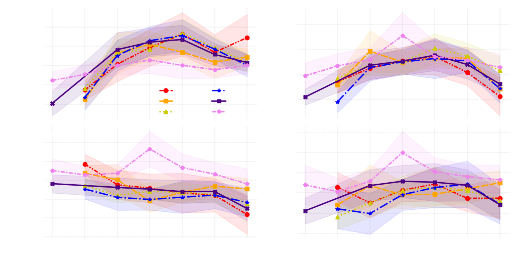
plt.savefig('Figure_export/xxx.png', dpi=600, bbox_inches='tight')Copy import pandas as pd
import numpy as np
import scipy.stats as st
import matplotlib.pyplot as plt
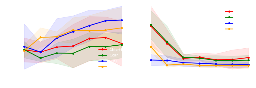
def PFT_extrapolation(ax1,ax2,df1,df2,color,tr):
ax1.set_facecolor((0,0,0,0.0))
ax2.set_facecolor((0,0,0,0.0))
col1 = [col for col in df2.columns if any(df2[col] > 2)]
df1.drop(columns=col1,inplace = True), df2.drop(columns=col1,inplace = True)
df2 = df2*100
d1,d2,dp1,dp2 = df1.values.T,df2.values.T,len(df1),len(df2)
m1,m2 = np.mean(d1, 0),np.mean(d2, 0)
lc1,hc1 = st.t.interval(0.95, dp1-1,loc=np.mean(d1, 0),scale=st.sem(d1))
lc2,hc2 = st.t.interval(0.95, dp2-1,loc=np.mean(d2, 0),scale=st.sem(d2))
x1 = np.linspace(1, dp1, num=dp1)
x2 = np.linspace(1, dp2, num=dp2)
ax1.plot(x1,m1,marker = 'o',markersize=4,linewidth=2,c = color,label = tr)
ax2.plot(x2,m2,marker = 'o',markersize=4,linewidth=2,c = color,label = tr)
ax1.fill_between(x1, lc1,hc1, alpha=0.1,color = color)
ax2.fill_between(x2, lc2,hc2, alpha=0.1,color = color)
ax1.set_xlabel('Number of PFTs trained',fontsize = 10, color = "white")
ax2.set_xlabel('Number of PFTs trained',fontsize = 10, color = "white")
ax1.set_ylabel('$R^2$',fontsize = 11, color = "white")
ax2.set_ylabel('$NRMSE$(%)',fontsize = 11, color = "white")
legend = ax1.legend(loc = 'lower right',facecolor= 'none',edgecolor = 'none',fontsize = 9)
for text in legend.get_texts():
text.set_color("white")
legend = ax2.legend(loc = 'upper right',facecolor= 'none',edgecolor = 'none',fontsize = 9,bbox_to_anchor=(1, 0.95))
for text in legend.get_texts():
text.set_color("white")
ax1.tick_params(labelsize=9, colors = "white")
ax2.tick_params(labelsize=9, colors = "white")
ax1.spines[['top', 'right', 'bottom','left']].set_color("white")
ax2.spines[['top', 'right', 'bottom','left']].set_color("white")
return
df = pd.read_csv("data/PFT_extrapolation.csv")
fig,(ax1,ax2) = plt.subplots(1,2,figsize = (10,3))
fig.set_facecolor('none')
fig.set_alpha(0)
plt.subplots_adjust(wspace =0.18)
config = {"font.family":'Calibri'}
plt.rcParams.update(config)
colors = {'Chla+b':'r','Ccar':'g','EWT':'b','LMA':'orange'}
trait_name = ['Chla+b','Ccar','EWT','LMA']
for tr in trait_name:
data = df[df["tr"]==tr]
df1 = data[data["metric"]=="R2"].iloc[:,:-2]
df2 = data[data["metric"]=="NRMSE"].iloc[:,:-2]
PFT_extrapolation(ax1,ax2,df1,df2,colors[tr],tr)
ax1.text(0.02,0.93, '(a) $R^2$ for PFTs extrapolation', transform=ax1.transAxes, fontsize = 10, color = "white")
ax2.text(0.02,0.93, '(b) $NRMSE$ for PFTs extrapolation', transform=ax2.transAxes, fontsize = 10, color = "white") Copy import pandas as pd
import numpy as np
import seaborn as sns
import matplotlib.pyplot as plt
from matplotlib import gridspec
from matplotlib.ticker import FuncFormatter
from matplotlib.ticker import FormatStrFormatter
colors = {'Chla+b':'orangered','Ccar':'dodgerblue','EWT':"pink",'LMA':'limegreen'}
colors2 = {'Chla+b':'blue','Ccar':'red','EWT':"green",'LMA':'orange'}
units = {'Chla+b':' ($\mu g/cm^2$)','Ccar':' ($\mu g/cm^2$)','EWT':' ($g/m^2$)','LMA':' ($g/m^2$)'}
site_label = {'Chla+b':[r"$S_{chl1}$",r"$S_{chl2}$",r"$S_{chl3}$",r"$S_{chl4}$",r"$S_{chl5}$",r"$S_{chl6}$",r"$S_{chl7}$",r"$S_{chl8}$"],
'Ccar':[r"$S_{car1}$",r"$S_{car2}$",r"$S_{car3}$",r"$S_{car4}$",r"$S_{car5}$"],
'EWT':[r"$S_{ewt1}$",r"$S_{ewt2}$",r"$S_{ewt3}$",r"$S_{ewt4}$"],
'LMA':[r"$S_{lma1}$",r"$S_{lma2}$",r"$S_{lma3}$",r"$S_{lma4}$",r"$S_{lma5}$",r"$S_{lma6}$",
r"$S_{lma7}$",r"$S_{lma8}$",r"$S_{lma9}$",r"$S_{lma10}$",r"$S_{lma11}$",r"$S_{lma12}$"]}
pft_label = {'Chla+b':['DBF',"CRP","GRA"],'Ccar':['DBF',"CRP","GRA"],
'EWT':['DBF',"CRP","GRA"],'LMA':['DBF',"CRP","GRA","SHR","vine","EBF","ENF"]}
temp_label = {'Chla+b':['EGS','PGS','PPS'],'Ccar':['EGS','PGS','PPS'],'LMA':['EGS','PGS','PPS']}
data_type = ["sites","PFT","temporal"]
fig = plt.figure(figsize = (14,15))
gs = gridspec.GridSpec(124, 80)
config = {"font.family":'Calibri'}
plt.subplots_adjust(wspace =0,hspace = 0)
plt.rcParams.update(config)
j = 0
for ds in data_type:
tr_name = ["Chla+b","Ccar","LMA","EWT"] if ds !="temporal" else ["Chla+b","Ccar","LMA"]
m = 0
for tr in tr_name:
data = pd.read_csv(f"../0_datasets/{tr}_dataset_{ds}.csv")
df, refl = data.loc[:,"Dataset ID":], data.loc[:,"450":"2400"]
ax = plt.subplot(gs[j:j+16, m:m+16])
axes = plt.subplot(gs[j+20:j+36, m:m+14])
axes1 = axes.twinx()
wl_min = '450'
wl_max = '2400'
d_all = refl.loc[:,wl_min:wl_max].values
m_all = np.mean(d_all,0)
std_all = np.std(d_all,0)
lc_all,hc_all = m_all-1.96*std_all,m_all+1.96*std_all
CV = refl.loc[:,wl_min:wl_max].std()/refl.loc[:,wl_min:wl_max].mean()
wl = np.arange(int(wl_min),int(wl_max)+1,10)
axes.plot(wl,m_all,linewidth=2,color = colors[tr], label = "mean reflectance")
axes.fill_between(wl, lc_all,hc_all, alpha=0.2,color = colors[tr])
axes1.plot(wl,savgol_filter(CV,25,3),linewidth=2,ls = '--',color = colors2[tr],label = "mean CV")
lines, labels = axes.get_legend_handles_labels()
lines2, labels2 = axes1.get_legend_handles_labels()
axes.legend(lines + lines2, labels + labels2, loc = 'upper right',facecolor= 'none',
edgecolor = 'none',fontsize=8,bbox_to_anchor=(0.98, 1.03))
axes.set_xlabel('Wavelength (nm)',fontsize = 9,labelpad = 3)
axes.set_ylabel(f"{tr} Reflectance", fontsize=9, labelpad = 0.2)
axes1.set_ylabel("Coefficient of variation", fontsize=9, labelpad =0.2)
axes.tick_params(labelsize=9, direction = 'in')
axes1.tick_params(labelsize=9, direction = 'in')
axes.yaxis.set_major_formatter(FuncFormatter(no_negative))
axes1.yaxis.set_major_formatter(FormatStrFormatter('%.1f'))
if ds == "sites":
site_info = df.groupby("Site ID")["Latitude","Longitude"].mean().sort_values(by='Latitude')
site_info['Latitude'] = site_info['Latitude'].round(2)
site_info['Longitude'] = site_info['Longitude'].round(2)
site_info['coordinate'] = site_info.apply(lambda row: (row['Latitude'], row['Longitude']), axis=1)
df_map = pd.DataFrame({'Site ID':site_info.index.tolist()})
sort_map = df_map.reset_index().set_index('Site ID')
df['Site_idx'] = df['Site ID'].map(sort_map['index'])
df.sort_values(by = ['Site_idx'],inplace = True)
df.reset_index(drop = True, inplace = True)
width = {'Chla+b':0.7,'Ccar':0.6,'EWT':0.6,'LMA':0.7}
sns.boxplot(x= 'Site ID', y= tr,data=df, color=colors[tr],ax = ax, fliersize=0.5,saturation = 0.8,linewidth = 0.5, whis =2,width = width[tr])
ax.set_xlabel(f'Site number of {tr} samples',fontsize = 9,labelpad = 3)
ax.set_ylabel(tr+ units[tr], fontsize=9, labelpad = 0.2)
ax.tick_params(labelsize=9, direction = 'in')
ax.set_xticklabels(site_label[tr])
if tr == "LMA":
ax.tick_params(axis = "x", labelsize=7, direction = 'in',pad = -0.5, rotation=35)
ax.set_xlabel(f'Site number of {tr} samples',fontsize = 9,labelpad = -3)
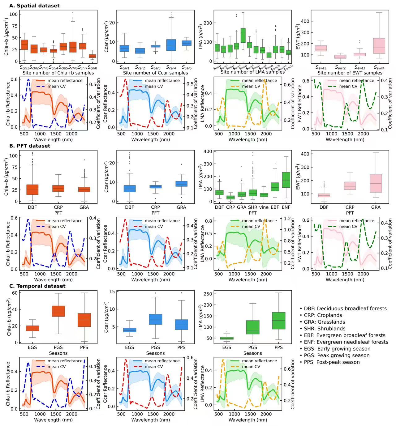
ax.text(-0.13,1.05, 'A. Spatial dataset', fontsize=10,transform=ax.transAxes,weight='bold') if tr == "Chla+b" else None
elif ds == "PFT":
df_map = pd.DataFrame({'PFT':['Deciduous broadleaf forests', 'Croplands', 'Grasslands',
'Shrublands','Vine','Evergreen broadleaf forests',
'Evergreen needleleaf forests']}) if tr == "LMA" else pd.DataFrame({'PFT':['Deciduous broadleaf forests', 'Croplands', 'Grasslands']})
sort_map = df_map.reset_index().set_index('PFT')
df['PFT_idx'] = df['PFT'].map(sort_map['index'])
df.sort_values(by = ['PFT_idx'],inplace = True)
df.reset_index(drop = True, inplace = True)
width = {'Chla+b':0.45,'Ccar':0.45,'EWT':0.45,'LMA':0.7}
sns.boxplot(x= 'PFT', y= tr,data=df, color=colors[tr],ax = ax, fliersize=0.5,saturation = 0.8,linewidth = 0.5, whis =2,width = width[tr])
ax.set_xlabel(f'PFT',fontsize = 9,labelpad = 3)
ax.set_ylabel(tr+ units[tr], fontsize=9, labelpad = 0.2)
ax.tick_params(labelsize=9, direction = 'in')
ax.set_xticklabels(pft_label[tr])
ax.text(-0.13,1.05, 'B. PFT dataset', fontsize=10,transform=ax.transAxes,weight='bold') if tr == "Chla+b" else None
else:
df_map = pd.DataFrame({'season':['early growing season','peak growing season','post-peak season']})
sort_map = df_map.reset_index().set_index('season')
df['season_idx'] = df['season'].map(sort_map['index'])
df.sort_values(by = ['season_idx'],inplace = True)
df.reset_index(drop = True, inplace = True)
sns.boxplot(x= 'season', y= tr,data=df, color=colors[tr],ax = ax, fliersize=0.5,saturation = 0.8,linewidth = 0.5, whis =2,width = 0.5)
ax.set_xlabel(f'Seasons',fontsize = 9,labelpad = 3)
ax.set_ylabel(tr+ units[tr], fontsize=9, labelpad = 0.2)
ax.tick_params(labelsize=9, direction = 'in')
ax.set_xticklabels(temp_label[tr])
ax.text(-0.13,1.05, 'C. Temporal dataset', fontsize=10,transform=ax.transAxes,weight='bold') if tr == "Chla+b" else None
text = ('• DBF: Deciduous broadleaf forests\n'
'• CRP: Croplands\n'
'• GRA: Grasslands\n'
'• SHR: Shrublands\n'
'• EBF: Evergreen broadleaf forests\n'
'• ENF: Evergreen needleleaf forests\n'
'• EGS: Early growing season\n'
'• PGS: Peak growing season\n'
'• PPS: Post-peak season\n')
ax.text(1.1,-0.5, text,fontsize=10,transform=ax.transAxes,linespacing=1.5) if tr == "LMA" else None
m = m+20
j = j+42
plt.savefig(f'1_Figures/1_leaf traits variations.png', dpi=500, bbox_inches='tight')Copy import pandas as pd
import numpy as np
import seaborn as sns
from scipy import stats
import matplotlib.pyplot as plt
from matplotlib import gridspec
from scipy.stats import gaussian_kde
from matplotlib.lines import Line2D
from sklearn.metrics import mean_squared_error
def rsquared(x, y):
slope, intercept, r_value, p_value, std_err = stats.linregress(x, y)
a = r_value**2
return a
def d(x,y):
xy = np.vstack([x,y])
z = gaussian_kde(xy)(xy)
return z
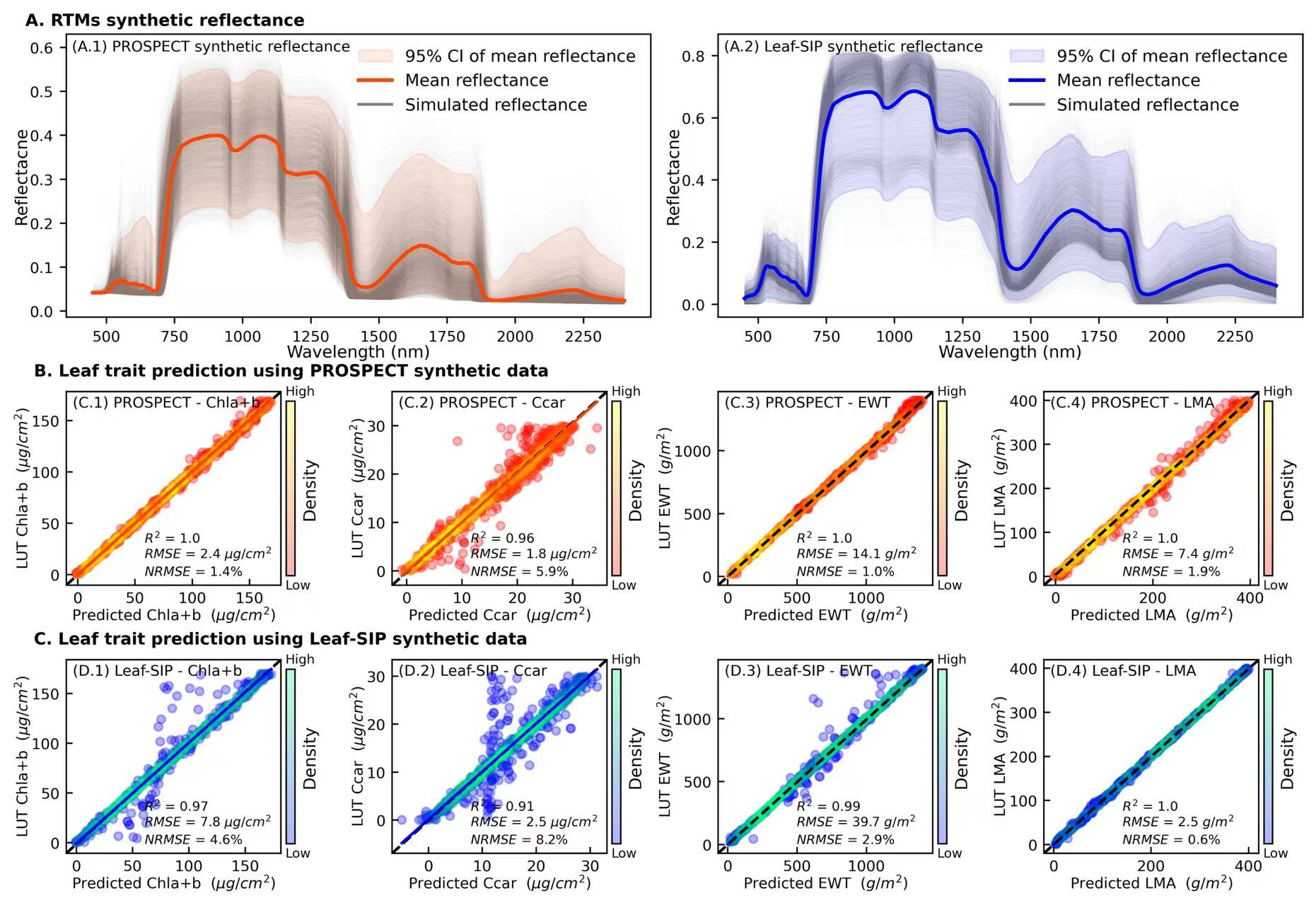
refl_pro = pd.read_csv("data/2_PROSPECT_reflectance_LUT.csv")
refl_sip = pd.read_csv("data/1_SIP_reflectance_LUT.csv")
#***********************************************************************8
fig = plt.figure(figsize = (12,8))
gs = gridspec.GridSpec(19,8)
config = {"font.family":'Calibri'}
plt.subplots_adjust(wspace =0.7,hspace =2)
plt.rcParams.update(config)
### PROSPECT synthetic reflectance [0-7, 8-13, 14-19]
ax = plt.subplot(gs[0:7, 0:4])
wl = np.arange(450,2401)
for i in range(len(refl_pro)):
temp = refl_pro.iloc[i]
ax.plot(wl,temp,linewidth=0.05,c = 'gray', alpha = 0.05,zorder = 1)
m_all = np.mean(refl_pro,0)
std_all = np.std(refl_pro,0)
lc_all = np.percentile(refl_pro, 2.5, axis=0)
hc_all = np.percentile(refl_pro, 97.5, axis=0)
ax.fill_between(wl, lc_all,hc_all, alpha=0.1,color = 'orangered',label = '95% CI of mean reflectance',zorder = 2)
ax.plot(wl,m_all,linewidth=2,c = 'orangered',label = 'Mean reflectance',zorder = 3)
ax.set_xlabel('Wavelength (nm)', fontsize=9, labelpad = 0.2)
ax.set_ylabel('Reflectacne', fontsize=9, labelpad = 0.2)
ax.tick_params(labelsize=8)
legend_elements = [Line2D([0], [0], color='gray', lw=1.5, alpha=1, label='Simulated reflectance')]
handles, labels = ax.get_legend_handles_labels()
handles.extend(legend_elements)
labels.extend(['Simulated reflectance'])
ax.legend(handles=handles, labels=labels, loc = 'upper right',facecolor= 'none',edgecolor = 'none',fontsize=9)
ax.text(-0.07,1.03, 'A. RTMs synthetic reflectance', transform=ax.transAxes, fontsize = 9,fontweight='bold')
ax.text(0.01,0.94, '(A.1) PROSPECT synthetic reflectance', transform=ax.transAxes, fontsize = 8)
### Leaf-SIP synthetic reflectance
ax = plt.subplot(gs[0:7, 4:8])
wl = np.arange(450,2401)
for i in range(len(refl_sip)):
temp = refl_sip.iloc[i]
ax.plot(wl,temp,linewidth=0.05,c = 'gray', alpha = 0.05,zorder = 1)
m_all = np.mean(refl_sip,0)
std_all = np.std(refl_sip,0)
lc_all = np.percentile(refl_sip, 2.5, axis=0)
hc_all = np.percentile(refl_sip, 97.5, axis=0)
ax.fill_between(wl, lc_all,hc_all, alpha=0.1,color = 'b',label = '95% CI of mean reflectance',zorder = 2)
ax.plot(wl,m_all,linewidth=2,c = 'b',label = 'Mean reflectance',zorder = 3)
ax.set_xlabel('Wavelength (nm)', fontsize=9, labelpad = 0.2)
ax.set_ylabel('Reflectacne', fontsize=9, labelpad = 0.2)
ax.tick_params(labelsize=8)
legend_elements = [Line2D([0], [0], color='gray', lw=1.5, alpha=1, label='Simulated reflectance')]
handles, labels = ax.get_legend_handles_labels()
handles.extend(legend_elements)
labels.extend(['Simulated reflectance'])
ax.legend(handles=handles, labels=labels, loc = 'upper right',facecolor= 'none',edgecolor = 'none',fontsize=9)
ax.text(0.01,0.94, '(A.2) Leaf-SIP synthetic reflectance', transform=ax.transAxes, fontsize = 8)
####
models = ['PROSPECT','Leaf-SIP']
tr_name = ['Chla+b','Ccar','EWT','LMA']
cmaps = {'PROSPECT':'autumn','Leaf-SIP':'winter'}
colors = {'PROSPECT':'orangered','Leaf-SIP':'blue'}
units = {'Chla+b':' ($\mu g/cm^2$)','Ccar':' ($\mu g/cm^2$)','EWT':' ($g/m^2$)','LMA':' ($g/m^2$)'}
title1 =['(C.1)','(C.2)','(C.3)','(C.4)']
title2 =['(D.1)','(D.2)','(D.3)','(D.4)']
j = 0
for kk, tr in enumerate(tr_name):
file_name = f'{tr}/1_PROSPECT_{tr}_ANN_LUT_pred.csv'
df = pd.read_csv(file_name)
x,y = df['ANN_pred'],df['LUT_obs']
if (tr =='EWT')|(tr =='LMA'):
x,y = df['ANN_pred']*10000,df['LUT_obs']*10000
R2 = f'$R^2$ = {str(round(rsquared(x, y),2))}'
rmse = f'$RMSE$ = {str(round(np.sqrt(mean_squared_error(x,y)),1))} {units[tr][2:-1]}'
nrmse = '$NRMSE$ = '+'{:.1%}'.format(np.sqrt(mean_squared_error(x,y))/(y.max()-y.min()))
ax = plt.subplot(gs[8:13, j:j+2])
ax.plot((0, 1), (0, 1), transform=ax.transAxes, ls='--',c='k', lw = 1.5)
scatter = ax.scatter(x,y,c= d(x,y), s=20,cmap='autumn',alpha = 0.3)
sns.regplot('ANN_pred','LUT_obs', data = df, ax = ax,fit_reg=True, ci = 95,scatter=False,line_kws = {'color':'orangered','lw':1.5})
ax.set_xlabel(f'Predicted {tr} {units[tr]}', fontsize=8, labelpad = 0.05)
ax.set_ylabel(f'LUT {tr} {units[tr]}', fontsize=8, labelpad = 0.05)
ax.text(-0.15,1.08, 'B. Leaf trait prediction using PROSPECT synthetic data', transform=ax.transAxes, fontsize = 9,fontweight='bold') if j==0 else None
cbar = plt.colorbar(scatter, ax=ax,pad=0.02, shrink=0.9)
ax.text(1.02,0.98,'High',transform=ax.transAxes,fontsize = 7)
ax.text(1.02,-0.02,'Low',transform=ax.transAxes,fontsize = 7)
cbar.set_ticks([])
cbar.set_label('Density', fontsize=9,labelpad=0.1)
ax.text(0.03,0.92,f'{title1[kk]} PROSPECT - {tr}', fontsize=8,transform=ax.transAxes)
ax.text(0.365,0.22,R2, fontsize=7,transform=ax.transAxes)
ax.text(0.365,0.14,rmse, fontsize=7,transform=ax.transAxes)
ax.text(0.365,0.05,nrmse, fontsize=7,transform=ax.transAxes)
ax.tick_params(labelsize=8,direction='in')
j = j+2
j = 0
for kk, tr in enumerate(tr_name):
file_name = f'{tr}/1_Leaf-SIP_{tr}_ANN_LUT_pred.csv'
df = pd.read_csv(file_name)
x,y = df['ANN_pred'],df['LUT_obs']
if (tr =='EWT')|(tr =='LMA'):
x,y = df['ANN_pred']*10000,df['LUT_obs']*10000
R2 = f'$R^2$ = {str(round(rsquared(x, y),2))}'
rmse = f'$RMSE$ = {str(round(np.sqrt(mean_squared_error(x,y)),1))} {units[tr][2:-1]}'
nrmse = '$NRMSE$ = '+'{:.1%}'.format(np.sqrt(mean_squared_error(x,y))/(y.max()-y.min()))
ax = plt.subplot(gs[14:19, j:j+2])
ax.plot((0, 1), (0, 1), transform=ax.transAxes, ls='--',c='k', lw = 1.5)
scatter = ax.scatter(x,y,c= d(x,y), s=20,cmap='winter',alpha = 0.3)
sns.regplot('ANN_pred','LUT_obs', data = df, ax = ax,fit_reg=True, ci = 95,scatter=False,line_kws = {'color':'blue','lw':1.5})
ax.set_xlabel(f'Predicted {tr} {units[tr]}', fontsize=8, labelpad = 0.05)
ax.set_ylabel(f'LUT {tr} {units[tr]}', fontsize=8, labelpad = 0.05)
ax.text(-0.15,1.08, 'C. Leaf trait prediction using Leaf-SIP synthetic data', transform=ax.transAxes, fontsize = 9,fontweight='bold') if j==0 else None
cbar = plt.colorbar(scatter, ax=ax,pad=0.02, shrink=0.9)
ax.text(1.02,0.98,'High',transform=ax.transAxes,fontsize = 7)
ax.text(1.02,-0.02,'Low',transform=ax.transAxes,fontsize = 7)
cbar.set_ticks([])
cbar.set_label('Density', fontsize=9,labelpad=0.1)
ax.text(0.03,0.92,f'{title2[kk]} Leaf-SIP - {tr}', fontsize=8,transform=ax.transAxes)
ax.text(0.365,0.22,R2, fontsize=7,transform=ax.transAxes)
ax.text(0.365,0.14,rmse, fontsize=7,transform=ax.transAxes)
ax.text(0.365,0.05,nrmse, fontsize=7,transform=ax.transAxes)
ax.tick_params(labelsize=8,direction='in')
j = j+2
plt.savefig('1_Figures/2_pretrained_DNN.png', dpi=500, bbox_inches='tight')Copy